The first step towards a new website is to complete a Design Brief – have a look at ours here.
It’s not just how a website looks that is important for a Design Brief. These are things to consider before you start filling it in – some obvious, some less so.
This is probably the only time a designer will say that more is more!
The more information you can provide the better. It is worth investing time in researching other websites before you fill in the brief. It will really clarify your thought processes about what you do and don’t want.
1 Be clear about what the purpose of your website is.
Every business needs a website, and plenty of individuals do too. But why you need a website varies significantly.
- Increase sales?
- Raise brand awareness?
- Informational?
- Subscribe to your blog?
You will have your business – or your personal – objectives, so make sure it is clear how a new website fits in to delivering these.
If you have an existing website, do an impartial assessment of the site.
You might be getting a new website, but that doesn’t mean you have to throw out everything. Make a note of features that are particularly popular. You can look at Google analytics to tell you which pages are most visited and which are least visited – if there are pages with low or no visitor numbers, get rid of them. But Google analytics won’t tell you what is missing. Ask a friendly client to go through your site and give you full and frank feedback.
Most importantly, is it responsive?
2 Decide how many pages you need.
If you are an E-commerce site, you might need more pages to sell your products than a freelance social media manager promoting their services.
A one-page website can be a great starting point for a new business.
3 Think about what features you need.
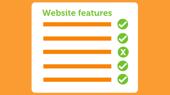
Think about what people come to your site for. Every website needs contact details. Many want contact forms, often a map. What will they need to take away from it? If you are a therapist, a customer might visit your website to book an appointment, so you need that facility. Or you might write a regular blog, so you need this facility on your website, as well as the chance for visitors to subscribe.
Do you want a Content Management System? Websites need regular updating. A CMS will make this easy for you to update it yourself.
How will you integrate social media into your site? Instagram, Facebook, Twitter – if you use these platforms, make sure they are on your website too.
Many features can be added to a website once it is live, but it’s helpful to get the critical pieces in place at the beginning.
4 Choose a single point of contact.

If there are several of you in your company, discuss all ideas for the website in advance. Then make sure there is just one point of contact with the designer to avoid confusion.
5 Decide a budget before you commission a website.
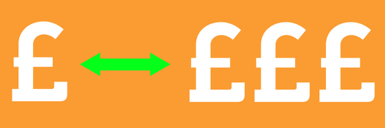
It’s great that you want a website – every business needs one. And it is really important at least to have a ballpark figure. It’s a bit like house-hunting – you wouldn’t go into an estate agent without having a guide figure about what you can spend. So you need to decide what level of investment you will make in your website.
A one-page website is the cheapest option, but your business might need a tailor-made design with multiple pages, which will require a larger investment. Read this blog for more advice about how much a website costs:
- A website can be Good and Cheap – but it won’t be Quick.
- A website can be done Quickly and be Good – but it won’t be Cheap.
- A website can be done Cheaply and Quickly – but it won’t be Good.
6 Timescale: be realistic.
If you have a date for a product launch or opening of a new branch, let your designer know. But be realistic – a good designer will take several weeks to design a draft site, add all the content, show you the dummy site, incorporate changes.
(See above…)
7 Think of three words that describe your website visitor.
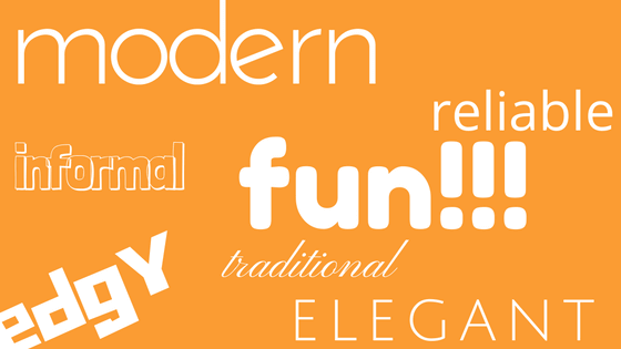
You want to make sure that the look of your website is appropriate for the audience. Think in terms of 2 or 3 of your ideal customers: age, interests, what sort of websites they might like, what sort of websites they might visit at the moment, location, how they will be viewing your site mainly (phone, desktop).
8 Find examples of websites you like, as well as websites you don’t like.
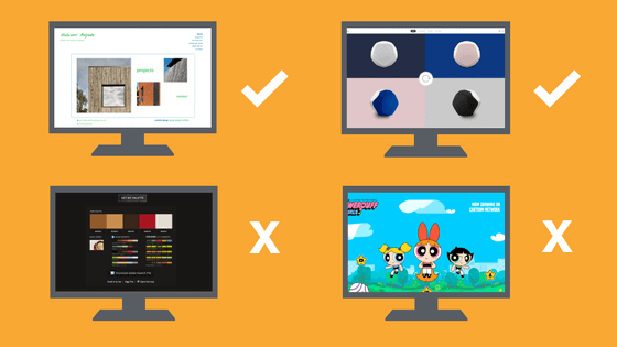
Sometimes putting visual ideas into words can be tricky, so giving examples of websites is the clearest way of communicating with the designer about your likes and – even more importantly – your dislikes.
Look at your competitors’ websites. See what styles and colour schemes they use. If there is a dominant style, decide whether you want to associate your brand with this or do something different to distinguish yourself.
What is it about the sites that you do or don’t like? Can you navigate them easily? Do you go back to the search results because you couldn’t find what you were looking for? Is the layout attractive? Does it look as good on your phone as it does on the desktop? Does it load too slowly?
Don’t forget to check out the designer’s portfolio.

Pick out sites you like, and point out any features on sites that you do or don’t need. (We can take it!)
9 Colour: make it count.

Colour improves brand recognition by 80% (University of Loyola, Maryland study).
Do you have brand colours already? Are you happy with these? Does your industry have colours that are commonly used for websites? You may want a colour scheme that reflects these common values. Or you might want to distinguish your brand by choosing something different.
I’ve written a blog about my Favourite Five Colour tools to help inspire you, but the designer will be happy to suggest great schemes too – that’s what we are experts in! If you don’t have a colour scheme in mind, it is still useful to tell the designer colours you don’t like. It is your website – you need to love it!
10 And, last but definitely not least, plan who is going to provide the content.
You know your business, your services, your product better than anyone. But providing content for a website is a time-consuming job. Think about what sections could be provided by other people. Or, if you want to do the content yourself, start with fewer pages, and add pages in the coming months.
Make sure that any content is what your visitors need, not just what you want them to have.
The quicker you can provide complete content the better. Don’t underestimate how long it will take to get all your content together, especially if it is being provided by several different people. Delays in content is the most common reason for delays in websites launches. Get ahead of the game and start gathering your content now. Many designers can help with this – make this clear when you fill in the brief. Read my blog about photos for websites.
Putting some time and thought into all of these points before you fill in your Design Brief will really help you have a website you love, and that works for you and your business.
More questions about what to include in a Design Brief? Get in touch – we love talking design! If you’re ready to complete a Design Brief now, then we’d be really happy to quote for doing a new website for you.

