Mobile First means that a website design starts with how the website will look on a mobile, then adding extra content as the screen size increases.
Mobile First is in contrast to a “Desktop-Lite” website, which starts with a website designed for a desktop screen and then cuts content which doesn’t work on a phone.
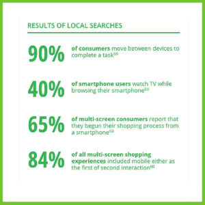
The majority of users now use their phones for most of their web use. The graphic below shows the latest (May 2016) statistics from The Mobile Playbook by Google:

For a Mobile First website, the user experience has to be integrated into all aspects of the design from the first design.
Not only must the text be the right size and the font be clear to read, the links must be easy to click, even with clumsy fingers.

The Home page needs to contain the information that the user might need the first time they land on the site – if it takes more than a few seconds to find what they need by clicking on the burger bar and searching for other relevant pages, they will go to the next site.
Another advantage with Mobile First is load time.
All the clever stuff behind the website you see determines how quickly the browser loads the site. If a website is designed Mobile First, only the content that relates to the phone will load. If a website is originally designed as Desktop-Lite, the browser will look at the whole content first, and then remove the content that isn’t needed for the small screen, wasting valuable seconds. As we all know, we rarely wait for a slowly-loading website on our own phones – we just move on to the next quicker one.
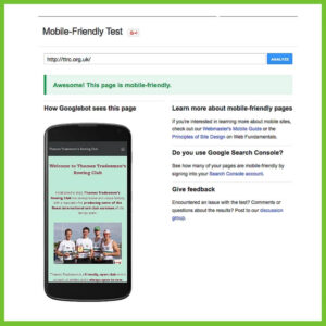
Check that your website on Google’s Mobile Friendly Test –

it won’t tell you if your website is Mobile First, but it will check that the design is suitable for mobiles.
To check that your website is Mobile First, ask your website designer.
A quick caveat – Mobile First inevitably means thinking small, and sometimes it is good to think big. So switching to a bigger scale of things whilst doing the mobile design can improve the design even more. It’s a bit like designing a building – if you can switch scale between the overall look of a building and, say, the scale and details of internal door openings, the design will be more harmonious.
Google has now said that it values Mobile First design. And where Google goes, a whole lot of us have to follow.
Confused by other website jargon? Read my blog on Responsive Websites. Or get in touch with other ideas for more Website Jargon explained!
