
A responsive website adapts the look and content of the site for different screen sizes.
When smart phones first appeared, companies adjusted to the new screen size by making new separate websites for mobiles. They worked, and looked fine, but they were inefficient and expensive to design, and needed to be updated separately.
Then Ethan Marcotte came along. His article, Responsive Web Design, in 2010 explained how a single website design could be adapted to suit different screen sizes. The magic? Media queries. Using this magical piece of code, every aspect of a website that is visible on a page – sizes, layout, colour, images – adapts, automatically, when a customer looked at your website on any device. The Responsive Website was born.
If you have a website, or even if you are just thinking about what to have, you don’t need to know how to use media queries. But you do need to employ a web designer who does.
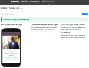
2016 marks the time when users are using phones to search the web more than any other type of device. Check if you have a responsive website with Google’s Mobile Test:
When you are thinking about how to make your website work better on your mobile, look at websites that work well for you. (Ironically, you probably haven’t noticed the best ones – when responsive websites work best, you don’t even notice – pity us poor designers…)
Here’s an example that I really like and works really well. Curzon Cinemas. Say you are thinking of going to the cinema tonight. You want to know what’s on in your area, what the showing times are, and maybe if you can book in advance. Curzon Cinemas pops up in the search results.
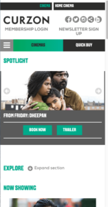
As soon as you click on the link, clear photos with neat summaries underneath appear in a list which you can scroll through – the design takes full advantage of the width of your phone so that photos are clear, and makes use of our normal expectation of scrolling quickly through a long list, all on one page.
It’s not just layout that needs changing for different screen sizes. Content needs to adapt too. Your mobile site needs to have only the most important information, with more detailed options available on bigger screens. Let’s look at Curzon Cinemas responsive website again.
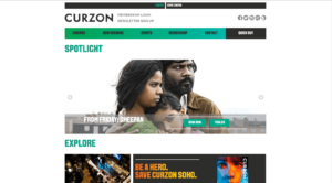
The Desktop Homepage has 6 tabs offering their full range of options, including “Events” and “Membership”, whereas the Mobile version has just two – “Cinemas” and “Quick Buy”. Which makes sense, doesn’t it?
So when you are planning the content of your website, focus on the most important elements for your Mobile site, and expand on these in more detail on your Tablet and Desktop versions.
Time to go responsive.
Read my blog on Mobile First for more insights. Or get in touch with ideas for more Website Jargon explained!