I have spent the last few months working on a website re-design for my own business, Green Ginger Design.
I want to share, here, the thought processes behind the changes. As a website designer and coder, this is my shop window. So it’s crucial that it the website re-design sells my design style.
Website re-design: brand identity
My website re-design zooms in on my two key colours: orange and green. The tones are now brighter and more vivid. I love the recent trend of Duotone websites, and wanted to use this style. So the photos all now have an orange-tinted mask. Focussing on only two colours has sharpened my brand.
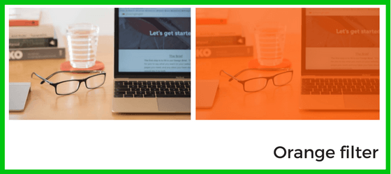
The new photos are by a professional photographer – Katie Vandyck. I wanted to invest in her expertise. I knew the style of image I wanted for my brand, and could rely on her to capture this, perfectly. Although stock photos are a great start for a new website, original content is really important to move your website on to the next level.
Sell my business
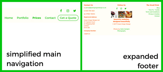
However much I love designing websites, this has to be a business. My website has to drive people to commission websites from me, so I needed clear call-to-action buttons. So, for the website re-design, I made all links and actions a bright, vivid green, and added a button – Get a Quote – to the main navigation so that anyone visiting could go straight to the Design Brief page.
Visitors need to know what your main purpose is, and a bit of encouragement to engage them works wonders!
Navigation
Users can get lost in the choice of pages on offer as navigations get more and more complex. The new Tate website is a great example of a simpler style of navigation. I simplified the navigation here, and focussed in on my key pages: Portfolio, Prices and Contact. The Footer has links to other important pages, as well as page links across the site. You can’t assume that your visitors will land on your Home page, so it is really important to have links and buttons, clearly identifiable as these by a consistent colour.
A new language
I also used this exercise to learn a new language, Flexbox. Flexbox has been around for a few years, but is now been recognised by all main browsers for a couple of years, so businesses can now viably use it. With Flexbox, websites adapt cleanly and easily to different screen sizes.
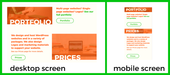
The more efficient a language is at doing this, the quicker a website loads. And, as users, we all know how important speed is.
I’d love to know what you think! Get in touch or comment below. I’d be happy to answer any questions you have about the different aspects of the re-design. And if you’d like your website to have a design overhaul, why not fill in the Design Brief, and I’ll give you a quote.

