What are my favourite websites right now? Not for me websites full of tricks that take seconds to load. I love clean design, with space on the site for the content to breathe.
I have used most of these sites many times. They are my favourite websites because I know that they not only look beautiful but work beautifully too. It goes (almost) without saying that they all look marvellous on any size screen. Not only does their layout adapt to different widths, but the content does too – people looking at a website on a phone need less content than people looking on a desktop, which means that the website loads more quickly.
One distinguishing characteristic of all these sites is simplicity, which is also the description clients request most often for their websites. And simplicity is far from simple – it takes real focus to pare down the content and style. These sites below have achieved it beautifully.
1 Tate
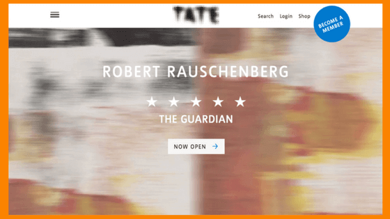
This website had a big revamp in 2016 – specifically not a new website, according to them. And it’s all the better for it. Much less navigation – the main navigation is down from 11 to 3 items, with additional navigation options elsewhere on the page. The layout is very clean, with blocks of images and text on a white background. The designers have tweaked the layout for the different Tate galleries, but each page is still recognisable as part of the overall Tate brand.
It’s also really interesting that they have included a page explaining how the website has evolved and why, as well as which areas are currently being worked on. All part of the trend for sharing information.
2 Beoplay
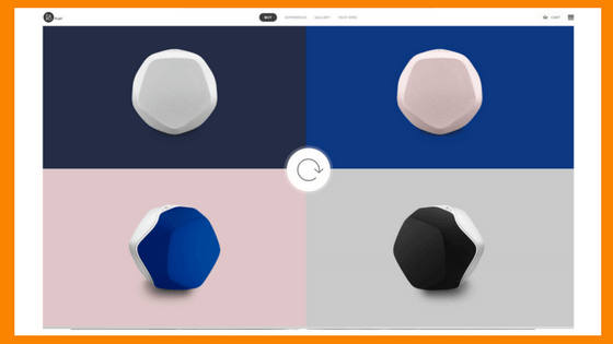
Pure beauty. This is high-end design. Fantastic use of scrolling, and beautiful subtle colour scheme. The designers have masterfully combined photography, graphics and colour. And it still functions.
The quality of the design emphasises the cutting-edge nature of the designed product without being gimmicky. I would trust that the product they are selling is high-quality and well designed because time and resources have been put in to producing this website.
3 Shakespeare’s Birthplace Trust
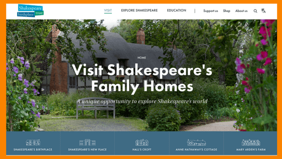
A client introduced me to this website – she included it on her Design Brief as an example of a website she liked. And I can see why. The faded mellow colour scheme is beautiful and appropriate.
This website is a great example of how to handle a lot of information. Colours in particular help guide you to different sections. Navigation is included at various places on the page, not just in the top bar, and the content is informative but succinct. Exactly what you want from somewhere to visit.
4 Typewolf
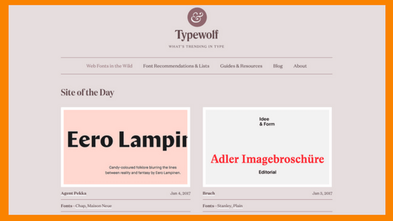
I have loved typefaces for many years, and it’s obvious that Jeremiah Shoaf, who runs this site, loves them too. Full of helpful advice and tips, it is my go-to site when I need inspiration. They have used graphics and colour to maximum effect, with virtually no photos.
A website that looks this simple is very, very sophisticated. An amazing resource for me as a designer.
5 AirBnB
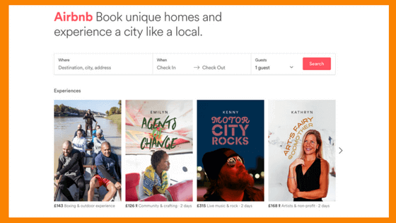
The opposite of Typewolf, AirBnB is a mega-site. Function is all-important, so the focus is on the quality of the search. Every search criteria I need is available, and it’s intuitive, too. The design has been really well adapted for all platforms, so you can look at the content on your phone via their app or a webpage.
Photos for individual places are provided by members, so the website can’t control every entry. But by using a block layout, giving the same size to every entry, and by allowing plenty of white space around every block, it creates an enticing, consistent look.
And one more I can’t resist: Toast
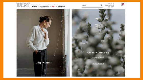
Love love love this site. So clean, and so so beautiful. Really really stunning photos. Pages galore, but I can always find the one I want. Toast has always set a high benchmark, and is continues to be one of my favourite websites.
“Perfection is achieved not when there is nothing left to add but when there is nothing left to take away.” Antoine de Saint-Exupéry
Says it all.

