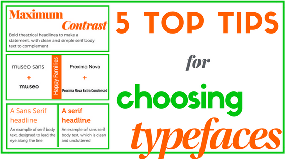
Choosing typefaces for your website can be daunting. But the choice you make matters. It needs to reflect the style of product or service you are selling, as well as being clear and readable on any size screen.
Here are my top tips to get you started:
1 Choose the same family
If you want to guarantee that different fonts you choose match, choose two from the same family.
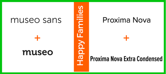
Museo and Museo Sans and a great choice for an informal style, and serif and sans-serif for contrast. Or try Proxima Nova – the most popular typeface on Typekit, with good reason: it’s modern, clean and legible. Use Extra Condensed for added contrast.
2 Serif v Sans Serif
Serif text is designed for reading in volume – the serifs help encourage the eye to move along the line, a bit like joined up writing. Sans Serifs, which were first designed in the 19th century, are, as the name suggests, don’t have the little joining lines. The clean looking typefaces became key to modern design. (You can read an interesting history here.)
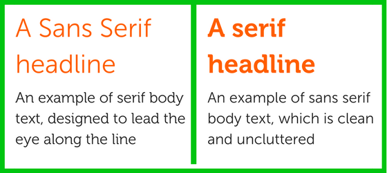
The classic choice for a print is Sans Serif font for headlines, and Serif font for body text.
But why not mix it up? I really like using a Serif font for headlines and Sans Serif for body text, for an more modern style.
3 Maximum Contrast
If you want to add real character to your website, choose a loud bold headline font, and use it as large as you dare!
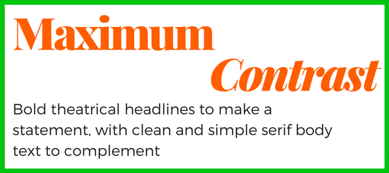
Pair this with a minimal clean sans serif font for maximum contrast.
4 Choosing Typefaces tools
The web is full of typeface devotees who have made fabulous websites to share their love. Scroll through and find some inspiration on choosing typefaces:
- Typotheque – my personal favourite for testing out combinations
- Andreas Weiss – another useful tool to play with font combinations, with a smaller choice of typefaces
- Typesperation – a huge selection of pairings
- Typewolf – a carefully curated selection, if you prefer less choice
Sometimes too much choice can be overwhelming, so I suggest starting with Typewolf if you don’t want to while away too many hours!
5 Copy!
“Good artists copy, great artists steal” – so said Picasso. If you see a website, and love the look of their font, check out what it is.
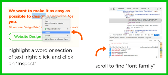
Highlight a word, right-click, then click on “Inspect” (in Chrome) or “Inspect Element” (in Safari). A box of code will appear alongside the web page you are looking at. Scroll through this to find “font-family”.
Want help choosing the best fonts for your brand? Fill in our Design ID Brief.
