
What is your brand’s Design ID? Do you have a clear identity? Does your brand express this identity?
Colour is a brilliant, immediate way to express you and your brand, and the starting point of your Design ID.
“Up to 85% of someone’s initial perception of your brand is down to the colour alone.” – Karen Haller, Colour Psychologist.
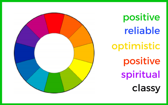
There are numerous psychological studies into how we see colour, and what different colours represent:
- Green? Positive, calm, harmonious – hence commonly used for environmental causes, and no better example than Greenpeace.
- Blue? Serious, reliable. Think Facebook or Boots.
- Yellow: optimistic, friendly – always makes me think of sunshine. Just look at the sunshine-filled Lipton Iced Tea website.
- Orange: warm, fun, optimistic – my choice of colour, so makes sense to me!
- Red: not just exciting and fiery, but warm, positive and active too – see the British Red Cross or Save the Children.
- Purple: rich, regal, spiritual – and, quite often, chocolate!
- Black and white? Designer, crisp, clear. Have a look at this wonderful showcase.
But colour is only one element.
Assuming your website is more than just photos, the typefaces you choose also convey qualities, consciously or unconsciously.
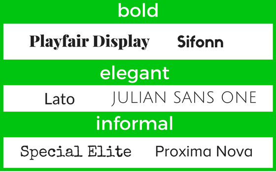
Are you selling business-to-business services? You will want your brand to look professional and reliable, so choose a classic typeface like Helvetica – favoured by designers for many years. Is your brand all about family life? Rather than the obvious playful typefaces, choose something informal, like Proxima Nova: clear and readable. Read my blog for more tips on choosing typefaces.
Now it’s time to crystallise your Design ID: combine a colour and typeface that sell the same message.
I’ll use an example that I designed. My client – a solicitor – was setting up a new business. She wanted it to look professional and serious. However, her clients were in the music industry, so the brand therefore wanted to look stylish and modern too.
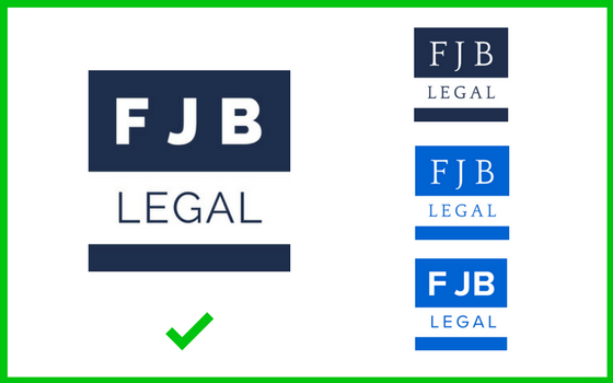
I opted for a deep, almost denim blue: serious but slightly more unusual than a standard navy or royal blue. And, to complement this, I chose Proxima Nova: clear, modern lettering. You can see alternative Design IDs – a brighter colour would have made the brand look modern, but I felt that was too visible. A traditional, serif font, like Quattrocento, is elegant, but immediately makes the brand look more serious, and wouldn’t appeal to the specific market. Have a look at the finished logo and website, where Promima Nova used for the logo is now combined with Lato: elegant and stylish.
Once you have a Design ID, stick to it. Make sure your website, logos and printed media all use the same combinations of colour and typefaces.
Do you have a favourite combination of colour and typeface? Please share below! Or if you would like help with your Design ID, fill in our Design Brief, and we will create one for you.