
Website colours matter for 4 reasons:
- Psychologically – certain colours have strong associations, although beware stereotypes. Pink for girls and blue for boys is sexist and outdated – so try to think beyond the stereotypes.
- Accessibility – contrast is important in making text readable for anyone with sight issues. Black and white might seem like the best option, but that can cause eye strain for long periods.
- Branding – needs to match your existing branding. (Sometimes it’s worth stating the obvious…)
- Usability – colour breaks up a page, and guides the eye to different sections. Call-to-action buttons need to draw attention, so need to be a bright colour that stands out against your background. Links need to stand out within the text. It’s even better if links change colour when you hover to reinforce the call-to-action.
How many colours do you need?
A good starting point for a website is to have one or two main colour/s, two greys, and an accent colour for a Call-to-Action.
If you use greys well, you can get away with a single colour for your website. Typemedia 2014 is a great example of this – a monochrome homepage that adds a single blue when you click on an individual typeface:

Typemedia 2011, in contrast, uses a spectrum of colour from limey-yellow to raspberry-sorbet:

Check out their other websites too for more inspiration – they have a different website every year using students’ work to advertise a Typeface MA at the University of the Hague (which is a great advert for the quality of their students) – Typemedia 2015 (flat colours), Typemedia 2012 (animated graphics), or Typemedia 2013 (black and white photography).
Do you have a brand colour already?
If you already have a brand colour, and want to choose colours that complement this, I recommend Paletton. Enter your colour’s hex number (e.g. #FF6F58), then click on the mini-wheels above the colour wheel for a range of options – monochromatic, adjacent, 3 or 4 contrasting colours, or free choice (if you are feeling adventurous).
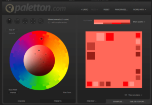
Play around with the controls.
Using a colour tool like this ensures the colours you choose will tone together. The amount of choice is enormous, but don’t get disheartened – if in doubt, keep it simple, and always make sure you like them!
Read recommendations of other colour-choosing tools here.
Need some inspiration?
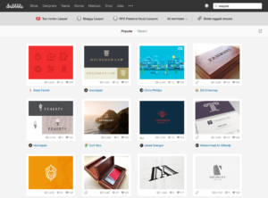
If you don’t already have brand colours, Dribble is a good place to start looking for ideas. (Warning – this could waste several hours….)
Search for a relevant area e.g. lawyer, and a range of logos and websites comes up:
Click on a website that appeals to you, and more information comes up. I like the look of Rocket Lawyers:
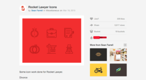
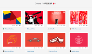
As it is the colour that particularly appeals to me, I can now click on the colours featured to get more options:
Bingo.
Want to know what is popular in 2016?
Websites have colour trends, just like fashion. Here is a list of the latest trends by AWWWards. Not necessary to follow them – sometimes it pays to be different – but it is always interesting to know what is on trend. Your choice then whether to follow or buck that trend.
Some “Do”s
Do trawl the web a bit. Look at websites you like. How many colours do they use? What does the website convey about the type of service/goods being displayed? Are the colours predictable for the type of service or product, or are they challenging convention?
Do trust your instinct – you have to love what you do, or what you sell, so make sure you love your website too! If you don’t like pastels, no rationale for pastel colours representing, say, openness and relaxation (according to Feng Shui) will make you like those colours any more every time you look at your own website.
And a “Don’t”
Don’t get too hung up on a precise colour – colours vary significantly from screen to screen. Check out different websites and tools on your desktop/laptop/mobile and compare.